Using the Live Preview with 50+ Device Presets
See exactly how your app looks on any device — from an iPhone SE to an iPad Pro — before you publish. MobiDrag ships with 57 real device presets built in.
1 Where to find the live preview
The live preview is built into the App Preview page. Open it from the App Builder by clicking the green Publish button in the top-right toolbar, or navigate directly via the App Builder menu.
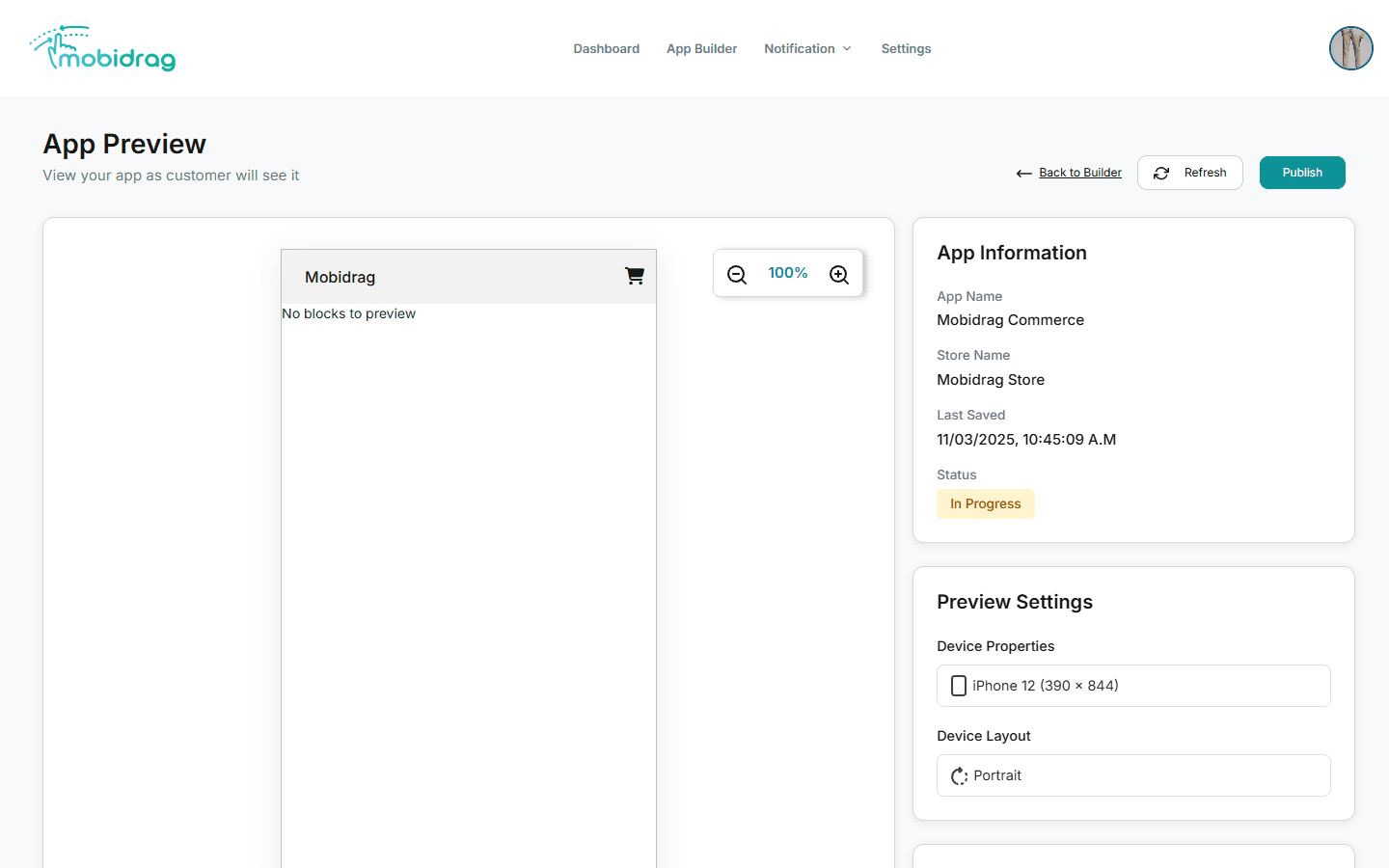
2 The phone preview panel
The large left panel contains a live phone mockup that renders your actual blocks — the same components your customers will see. The preview updates automatically whenever you save a change in the App Builder and click Refresh.
| Element | Purpose |
|---|---|
| Phone frame | Visual device shell that adapts to the selected device dimensions |
| Zoom controls (− / +) | Scale the view from 50% to 200% so you can inspect layout details |
| Zoom percentage | Shows current zoom level (defaults to 100%) |
| Back to Builder | Returns to the App Builder without losing your work |
| Refresh | Reloads the latest saved design into the preview |
3 Choosing a device preset
In the right sidebar, under Preview Settings, open the Device Properties dropdown. It lists all 57 preset devices organised by brand and model.
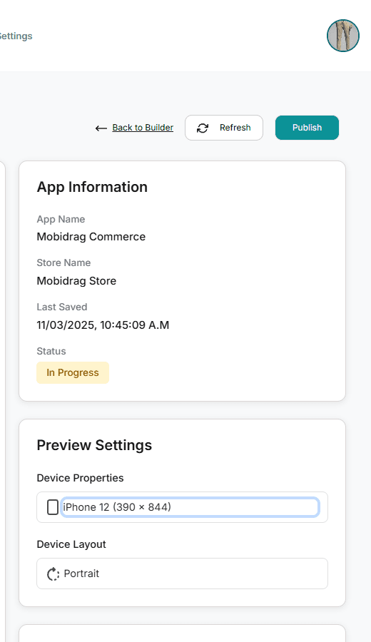
- 1Go to the App Preview page (click Publish in the App Builder toolbar).
- 2In the right sidebar, locate Preview Settings → Device Properties.
- 3Click the dropdown and scroll to the device you want to test.
- 4Select the device — the phone frame resizes immediately to match the real pixel dimensions.
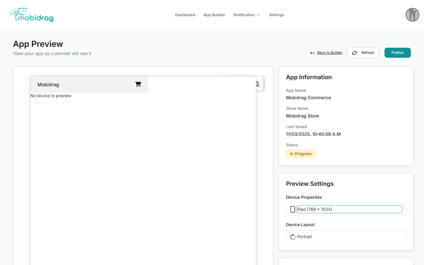
Always test your home page on at least iPhone SE (the smallest common screen at 375×667) and iPhone 14 (a modern tall screen at 390×844) before publishing. If it looks good on both, it will look good on most phones.
4 Using the zoom controls
The − and + buttons above the phone frame let you scale the view. This is useful for:
- Zooming out to see a tablet preset without scrolling
- Zooming in to inspect fine details like font size, icon spacing, or border radii
- Fitting an iPad preview on a laptop screen (try 70–80%)
The zoom percentage resets to 100% each time you change device preset.
5 Full device list (57 presets)
| Category | Devices |
|---|---|
| iPhone | SE (375×667), 6/7/8 (375×667), X (375×812), XR (414×896), XS (375×812), 11 (414×896), 12 (390×844), 13 (390×844), 14 (390×844) |
| iPad | iPad (768×1024), iPad Mini (768×1024), iPad Air (820×1180), iPad Pro 11" (834×1194), iPad Pro 12.9" (1024×1366) |
| Google Pixel | Pixel 2 (411×731), Pixel 3 (411×823), Pixel 4 (411×869), Pixel 5 (393×851), Pixel 6 (412×915), Pixel 7 (412×915) |
| Samsung Galaxy | S5 (360×640), S8/S9/S10/S20/S21/S22, Galaxy Fold (280×653 folded), Note 20 |
| Other Android | OnePlus 9, Xiaomi Mi 11, Surface Duo (540×720 per pane) |