How to Switch Portrait / Landscape in Preview
Instantly rotate the preview between portrait and landscape to check that your blocks look great in both orientations before you publish.
1 Where is the orientation control?
The orientation toggle is in the Preview Settings section of the right sidebar on the App Preview page. It appears directly below the Device Properties dropdown and is labelled Device Layout.
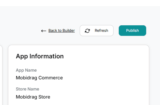
2 Switching between portrait and landscape
- 1Go to App Preview (click Publish in the App Builder toolbar).
- 2In the right sidebar, find Preview Settings → Device Layout.
- 3Click the Device Layout dropdown — it shows Portrait or Landscape with a rotate icon.
- 4Select Landscape to rotate. The phone frame swaps its width and height dimensions instantly.
- 5Select Portrait to rotate back.
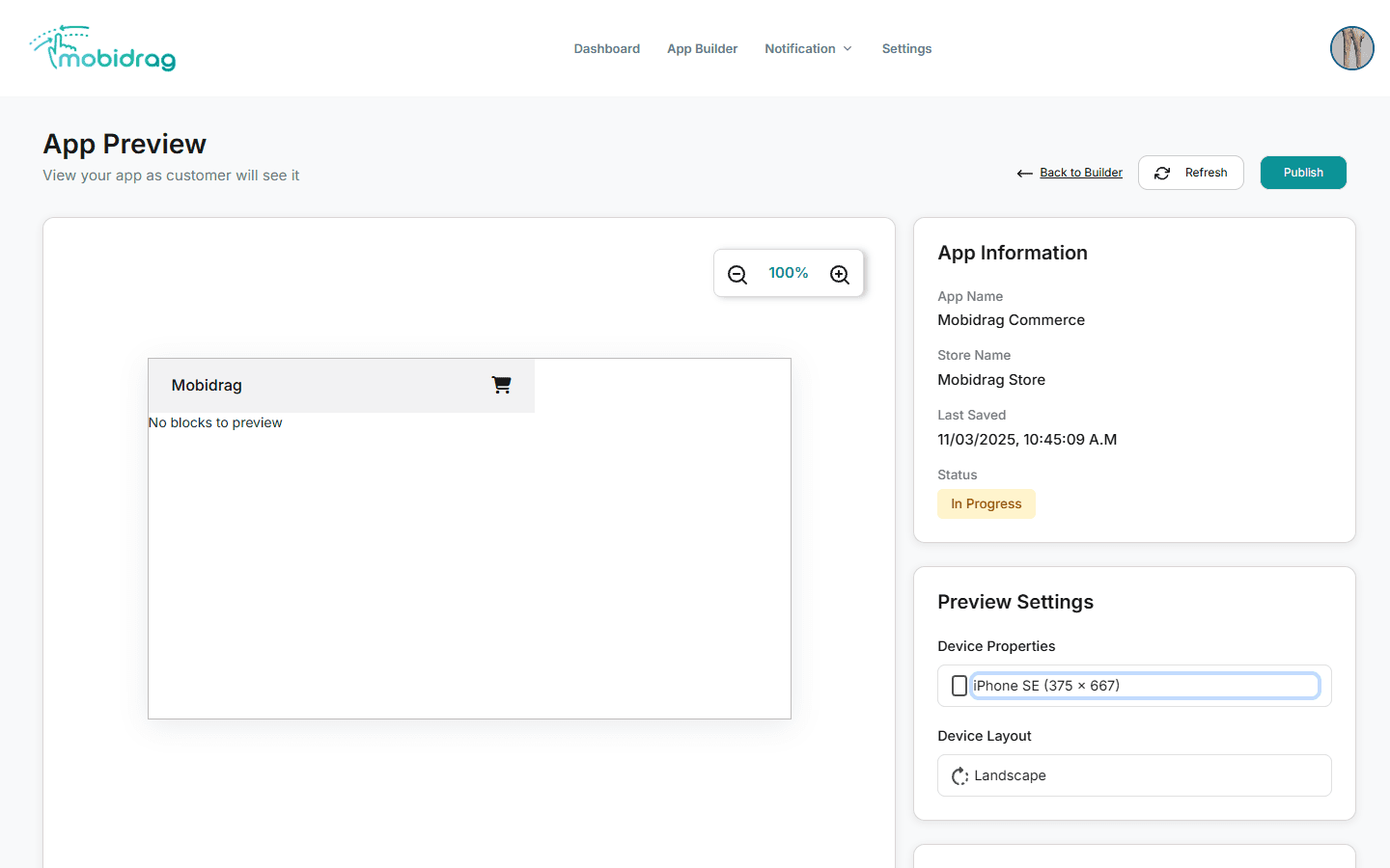
The width and height values are simply swapped when you change orientation — e.g. iPhone 12 (390×844) becomes (844×390) in landscape. No layout reflow happens; your blocks maintain their order.
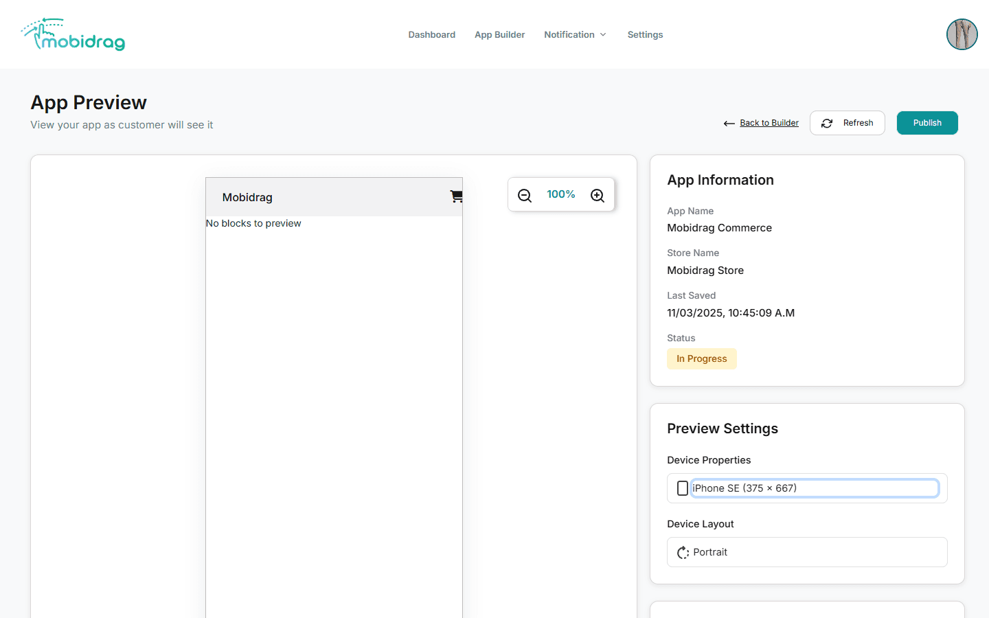
3 How portrait mode looks
Portrait is the default orientation for all mobile commerce apps. Your blocks stack vertically in a tall, narrow canvas — the way most shoppers hold their phones.
4 How landscape mode looks
Landscape mode rotates the preview 90°, giving a wide, short canvas. This is how your app appears when a user rotates their phone horizontally — useful for video content, image galleries, or tablet views.
5 Design tips for landscape
- Hero banners — wide images crop differently in landscape. Use a centre-anchored image so the key visual stays visible.
- Product grids — a 2-column grid in portrait may feel too narrow in landscape; consider switching to 3 columns via the block settings.
- Text blocks — long lines of text are harder to read in landscape. Keep paragraphs short.
- Navigation bars — footer navbars sit at the bottom regardless of orientation; no changes needed.
Most shoppers browse in portrait. Use landscape testing as a stress test rather than your primary design target — if portrait looks perfect, focus your fine-tuning there.